

This Precious Metal is On the Verge of a Massive Breakout. Here’s How to Catch It!

Gold at $3,100 and silver at $50? That might’ve sounded wild a year or two ago, but it’s now the upper trajectory some analysts are eyeing. With consumer confidence cratering to a 12-year low, inflation expectations rising, and central banks hoarding bullion like it’s the latest fashion, gold is holding firm above $3,000 per ounce and silver is knocking on $34.
There’s another thing to consider: the gold-to-silver ratio is still high, reaching 91:1 on Monday and 89.7 on Tuesday, hinting that silver may be massively undervalued. If the ratio snaps back to historical norms, silver could explode past $40, even $50, while gold edges toward $3,100 or higher.
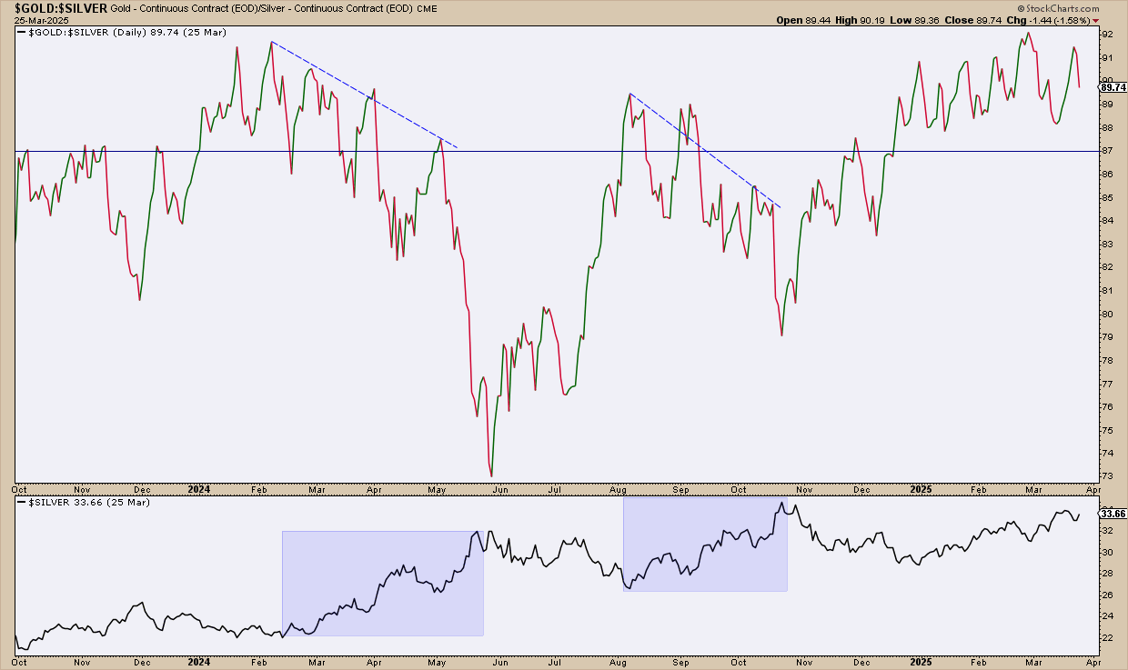
FIGURE 1. CHART OF GOLD/SILVER RATIO. The historical average is at 65:1, well below the data on the chart. Any level above 87 signals a potential buying opportunity.
Note how the price of silver, namely its rallies highlighted in the shaded area below the chart, is responding to the ratio. I’m going to cover this in more detail below, as the ratio serves not only as guidance but also as an important component for an entry setup.
So, if analysts are targeting $3,100, where is gold now, and what setup might it present? Take a look at a daily chart.
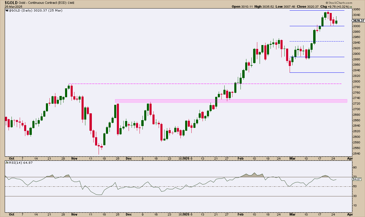
FIGURE 2. DAILY CHART OF GOLD. Gold is pulling back, an ideal setup for those who are bullish on the yellow metal.
Gold has pulled back from its all-time high of $3,056, coinciding with an overbought reading in the Relative Strength Index (RSI). The Quadrant Lines give you a wide range of support levels for entry.
- The second quadrant, containing the previous swing high at $2,960, may see some bulls jumping in.
- Below that, the third and fourth quadrants coincide with the two previous swing lows near $2,890 and $2,840.
Staying within and bouncing from these quadrants could signal continued strength in the current swing. Below that level would indicate the end of the current uptrend, and whether the price reverses or falls into a range, you will likely find plenty of support at the two areas highlighted in magenta.
Next, take a look at a daily chart of silver.
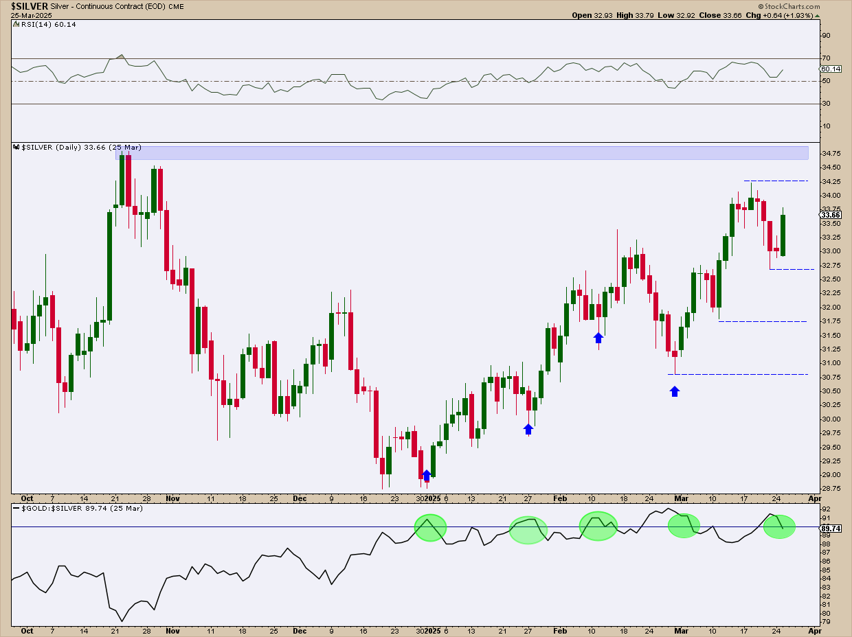
FIGURE 3. DAILY CHART OF SILVER. According to the gold/silver ratio, silver may be poised for another leg up.
Take a look at the green circles highlighting where the gold/silver ratio exceeded 89. These are relatively high levels, considering that the average ratio reading is between 65 to 75 depending on the historical average you’re measuring. As soon as the ratio falls below that level, silver tends to rally. You see this twice in January, plus once in February and March; now that the ratio has risen above this level once again, will silver rally in response? That’s the big question, and one you should keep focused on.
The $40–$50 target range that many analysts are eyeing is still a distance away. The RSI, holding above the 50 line, suggests there’s room for more upside before hitting overbought territory.
If you’re bullish on silver, hoping for it to reach the projected levels above $40 and toward $50, here’s what you should focus on:
- Silver would need to break above resistance levels at $34.25, the most recent swing high, and $34.75, which would see the grey metal enter its 12-year high territory, paving the way to $40 and above.
- If silver pulls back, it should stay above (ideally) $32.75 and $31.75.
- A close below $31.75, even if it finds support at the next swing low at $30.75, would signal weakness and likely invalidate the current uptrend.
What does this mean for investors using ETFs like SLV and GLD?
As a stock investor, you’re likely not seeking exposure to precious metals in the futures or spot market. The most commonly traded metals-backed options are the following ETFs:
- SPDR Gold Shares (GLD), which you could learn more about in the StockCharts’ Symbol Summary; and
- iShares Silver Trust (SLV), whose info is also available in the Symbol Summary.
The prices will differ as ETFs are structured differently. With that said, what do these price moves mean for the ETFs?
- If gold climbs to $3,100 an ounce, GLD—designed to track 1/10th of an ounce—could be trading in the $310 to $330 range.
- If silver makes a run at $50, SLV could surge right alongside it, potentially hitting $50 per share.
If you’re looking to ride the metals rally without holding physical bullion, these ETFs offer a direct and highly liquid way to gain exposure. And if silver’s historical catch-up to gold kicks in, SLV could potentially deliver the bigger upside.
At the Close
Gold and silver are both showing signs of strength, backed by macroeconomic pressure, historical ratios (at least for silver), and the overall technical context. Silver could be setting up for a catch-up move that might outperform gold in percentage terms. So, stay nimble, watch your levels, and remember that when silver moves, it often moves fast.

Disclaimer: This blog is for educational purposes only and should not be construed as financial advice. The ideas and strategies should never be used without first assessing your own personal and financial situation, or without consulting a financial professional.